

Little Cathedral Blog

Merch Review: Sticker App Clear Translucent Sticker
PERMISA mi ciela! Remember that recently I made some clear stickers with Sticker Ninja, but was unsuccessful? Remember how much I raved about Sticker App’s value chart? Well, this time I decided to try the Sticker App clear stickers for the translucent effect, and, you guessed it, I was unsuccessful too! So let’s buckle up and explore this journey.

My first order from Sticker App was placed in 2017 (almost a decade ago). I remembered that my first glossy sticker came out with crispy details and vibrant colors. First try, no errors, and probably no soft proofing back then (I can’t remember). So, in this case, since I already bought the Sticker App’s sample pack and failed my first try with Sticker Ninja, I decided to use the Sticker App’s clear stickers for documentation.

The Amazing Chart With Missing Info
The value chart is visually beautiful but lacks important information. The coding of decimals you are seeing on each hue or color is the CMYK format, but it doesn’t state if this chart is based on an 80% or 50% overall opacity. Below, we can see the white in “30%” to “15%” opacity. Does this mean that initially the sticker was 100% full color, and by reducing it to 30%, it turned out to have an overall color base between 70% to 85%?

I’m fully aware that I’ve been using the word transparency interchangeably with opaque and translucent; all 3 terms differ completely. Perhaps this may be my confusion or lack of success in replicating what I’m looking for. There is a helpful article called “What’s the Difference Between Transparent, Translucent, and Opaque?” from MetWest‘s blog explaining in detail when it’s applied to objects like windows or glass doors.

Investigating Before Ordering
I contacted the team to make sure that the requirements were met to be able to replicate the same translucent effect from their value chart of the clear sticker. The team promptly replied via email and explained the process briefly.
The opacity is totally up to you, but I would highly suggest staying between 15% and 30% opacity… Sometimes if your color is light enough you don’t even need to change the opacity (ex: light green, orange, pink, etc). Even full opacity black has SOME transparency if you don’t print a layer of white behind it. – Sticker App Staff

Interactive Platform
When I was finishing the details of my order, I was met with this awesome interactive platform where I could move the sticker (diagonally) to see how reflective the material would behave depending on what I chose. This also included the breakdown of how the colors would look depending on their “effect” options. One of the best features the platform had was the ability to change the background for better visibility on what I was working on.


Based on their explanation in the first email, when I contacted them with questions, I decided that since a 15% to 30% may seem barely translucent, I would go with a 50% opacity overall. This was to avoid the result of the 70% opacity overall in Sticker Ninja. When I purchased my order, there was a glitch in their site with my shipping info, and it didn’t update my country. I contacted them again, and thankfully, they fixed the information.

Issues With My First Order
When I received my order, I was not satisfied. Besides barely having a translucent effect, the colors came out dull (it’s kinda hard to see it via photos vs having the sticker accessible). The next thing I did was to review my file to make sure nothing was missing (the file was sent correctly), but I remember that no soft-proofing was sent by the team before production.
I searched their site if they provided any soft-proofing after purchase, but couldn’t find the answer. So, I contacted them once more and explained my dissatisfaction by sharing some comparisons of the overall color quality (saturation) between Sticker Ninja, the Sticker App order from 2017, and my homemade stickers. This was also followed up with my frustration of not being able to replicate the translucent effect with Sticker Ninja.

The Fixes & Comparison
They replied kindly that the comparisons, although understandable, each company has its own settings, machines, and processes (which is a fair response). They offered to reprint the stickers to correct both issues: increase saturation and replicate the translucent effect as their value chart.


We went through a lot of back and forth during December. The representative was attentive to details and patient with my questions during a busy holiday.
There are two things that needs to be considered when you are ordering clear stickers. If you reduce the opacity of the original colors in your file and still add the clear effects in it, with or without opacity like we spoke, it will look a lot more saturated. – Sticker App Staff


Close Up Details
During the conversation, I agreed that even if the translucent effect failed, I wanted to achieve the improvement of the color quality by increasing the saturation. When the reprint was delivered and inspected, I could confirm that the saturation was fixed, and the translucent effect had improved slightly, but not at the level I was seeking.

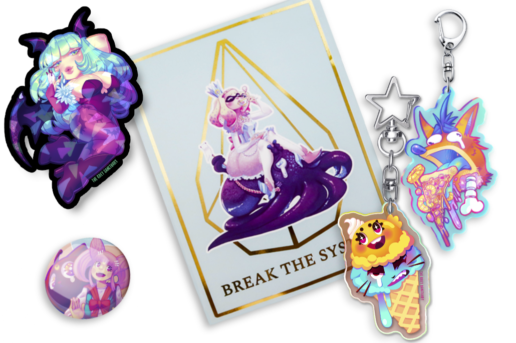
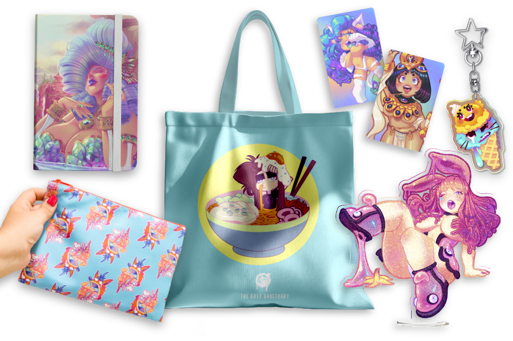
The Freebies
I don’t recall if the first order came with freebies (I don’t think so), but when I contacted the team due to my dissatisfaction with the order, they reprinted a second batch, and this time it included some adorable freebies. This was sent with my reprint order, which was such a sweet detail.


I also love the details of the artworks in their labels, especially giving tribute to recognizable IPs.

Conclusion
I could’ve easily rated this review with a 4-star due to not achieving the translucent effect I desired based on their value chart from the sample pack. I could’ve also, if I were not Jessa, been a Karen and trash this review and the team for not understanding, willingly, how their business operates. But to be honest, I must give the credit where it’s due. The team did their best to respond promptly, answer my questions, and fix the issues.
I’m thinking that the best approach to fix this is by creating my own translucent chart with each company showcasing my most used hues and different percentages of the opacity as an effective and accessible tool to avoid uncertainty before production. I can’t stress enough that even though things may seem ok or pretty digital, it’s another story when you have it in a tangible format and can see the difference in the quality between pixels and inks. Review carefully and document to minimize errors.
Cost & Shipping
I spent around $36 for 15x clear stickers with a 4″ size, and it was a good investment, since I can’t produce this material or effect at home.
Quality
The quality is great, although in my first order, the colors came out dull; the company did fix the issue, and my stickers came out more vibrant.
Quantity
I have nothing negative to say about the quantity since they are big stickers.
Communication
The staff was attentive, prompt, and serious with my questions and concerns. They took their time to explain their protocols and offer various solutions to achieve my satisfaction.
Overall 5 ☆ 5
I encourage any artist to try their services and reach out if you have any concerns, doubts, or issues with your order. To better understand the materials your company offers, consider creating customized charts for improved results. Also, I can’t stop playing with their interactive platform of the different materials on your custom sticker.
Thank You For Reading!
If you appreciate my work and documentation and would like to see more, please consider supporting my growth and dedication by further exploring, investing in, and maintaining my website.


ABOUT ME

Jessa Otero | VisDev Artist & 2D Animator | P.R


Leave a Reply